This paper is a part of the IPR Behavioral Insights Research Center.
From the time of prehistoric cave paintings, people have been using images to share ideas and information with each other. Communicators have long recognized the importance of visuals, which is deeply rooted in our reliance on our sight and vision to process and make sense of the world around us.
Technological advancements have led to many new possibilities in the way we create and communicate with images. However, an understanding of how these images influence our thinking, and those of our primary stakeholders, is needed to use them effectively in our public relations and communications management programs. Cognitive psychology research shows us that images can strengthen communications in several different ways—they can capture attention, evoke emotions, and easily convey large amounts of information in a relatively short amount of time. Several recent studies highlight these processes and yield valuable insights for communicators.

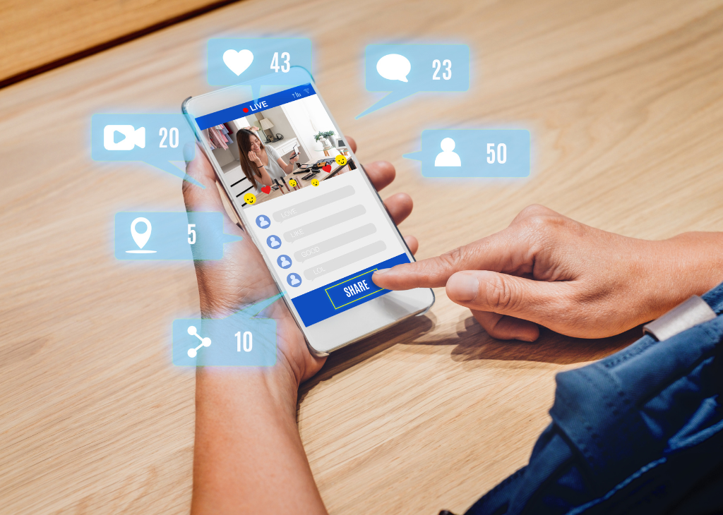
Capturing Attention Through Social Media
Social media presents unique challenges and opportunities for communicators because audiences are connected to a constant feed of new content, curated by members of their own tribes and social circles.
Having people pay attention to messages is a critical step for successful communication. Visuals are an effective way to help a message stand out, especially with online communications where there is competition and noise. In recent study, Kate Keib and colleagues (2018), examined the influence of images on attention and behaviour in the context of social media, where platforms like Facebook and Twitter have become a prominent way to share and consume information. The results found participants spent twice as long looking at news posts with pictures, compared to those without, indicating the importance of including pictures when communicating on social media.
Selecting the right visual for communicating is essential. In public relations, the goal is often not just to communicate information, but to influence attitudes or beliefs. Visuals contribute to this goal by capturing an audience’s attention, evoking emotions or making information easier to understand.

Evoking Emotion
Photographs, while useful for conveying contextual information, can also evoke strong emotional reactions that motivate behaviour. Other findings from Keib’s 2018 study suggest that people are more likely to share and click on news posts that include positive images, potentially to enhance other’s impressions of them, since sharing is a public action.
More specific emotions like anger, outrage, or fear can also motivate information-seeking and sharing behaviours in different ways. Fear might drive someone to want to know more about a situation, but make them hesitant to share information to avoid appearing afraid. However, fear can also motivate sharing to warn others. Context and personal characteristics play important roles in determining the behavioural outcomes, so testing images used in communications can be a valuable process.
Part of selecting the right image is matching it with the right text that support the underlying message. Jennah Sontag (2018) conducted a study testing three types of images for a poster with a message encouraging university students to seek help for mental health. Each image depicted one of the three stages of depression: suffering, treatment, or recovery.
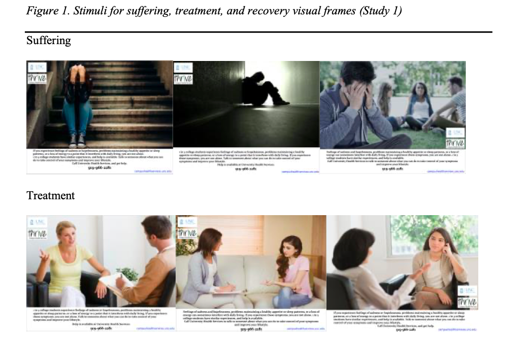
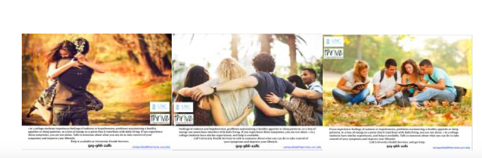
While an image of suffering may have been descriptive of the poster’s overall topic, it didn’t fit the message of seeking help. Participants who saw the posters with images of recovery and positive outcomes felt more positive emotions like hope, confidence, and optimism. These emotions led to greater aspirations to be like the people depicted, whereas negative emotions from the images of suffering had the opposite effect, which counteracts the intended message.
Another example that highlights the importance of matching visuals with the message comes from research by Danny Flemming and colleagues (2018), who examined the interactions among communication formats and the use of visuals. They focused on wildlife conservation messaging to see whether narratives or fact lists were better suited for educating people and changing their attitudes toward wildlife in order to gain support for conservation initiatives.
Narratives are effective strategies for communication because they can captivate audiences in the story and evoke emotions, which sustain attention and reduce potential counterarguments against the underlying message. Fact lists, on the other hand, make information easier to understand by presenting it in a clear and simple format.

The researchers presented participants either a fact list or narrative about foxes in urban environments and compared their knowledge of foxes, attitude toward their conservation, and perception of risk toward humans before and after presentation. The communications were shown either with or without photographs of baby foxes to test whether the positive emotions associated with images of young animals would improve the impact. They found that both formats were effective for increasing knowledge about foxes, improving attitudes towards fox conservation, and reducing risk perceptions. However, when the fact list included an image of a baby fox, participants learned less than if it was the fact list alone. The opposite was true for the narrative format—stories with images led to greater knowledge gain than those without.
When paired with a story, an emotional response to images can further motivate people to become more involved in a story, leading to better processing and recall of embedded information. On the other hand, when paired with fact lists, the emotion-evoking images can distract from information processing. Images that provide specific examples or greater context may be better suited for communications intended for presenting information in a more accessible way.

Visualizing Data
When communicating complex information, data visualizations, like maps, charts, and graphs, can present large sets of data in more meaningful and understandable ways. They allow for audiences to observe trends and patterns easily, reducing the mental effort required to process the information and thereby increasing engagement. Research has shown that data visualizations can bolster communications for changing attitudes and behaviour.
For example, Brendan Nyhan and Jason Reifler (2019) found that corrections of misinformation were more effective when the supporting evidence was presented in graph form instead of text. Alexa Spence and colleagues (2019) demonstrated that workplace energy consumption could be reduced by providing office workers with information about energy consumption and supporting their understanding of it through data visualizations and other digital behavioural tools.
When using data visualizations, it is critical to consider how they are designed. Research by Nan Li and colleagues (2018) demonstrate several design factors to consider, such as the importance of aesthetic appeal. People find visualizations that they consider well-designed and attractive to be more credible overall. The source of the data should be highlighted if it is a trusted source, like including a university logo, because it adds to the data’s credibility. Interactive features like the ability to zoom, sort, filter, or navigate between different data sets or visualizations can support information processing if they are easy and intuitive. However, if they are overly complicated or confusing, they can distract audiences and interfere with comprehension instead.
Another important consideration is selecting the right type of visualization for the data, recognizing that some types may be less appropriate and can lead to negative perceptions if they do not meet audiences’ expectations, especially if they are familiar with the topic.
Communicators can further enhance data visualizations by adding visual cues to emphasize a trend or direct attention to specific data points (Tao, Yuan & Qu, 2019). Cues, like different colours, overlays, or symbols, can help orient people to the most important information or the intended message, instead of leaving the interpretation entirely up to the audience.

Putting it All Together
There remains much to learn about visual communication and why some applications are more effective than others. A clearer understanding of the underlying cognitive processes and the roles that pre-existing knowledge and attitudes play will help explain the individual differences in how people react to visual communication. It will also be important to determine how visuals interact with other forms of communication and how different emotional responses impact outcomes.
Research shows that there are many factors for communicators to consider when incorporating visuals into their work. Visuals should complement the message by aligning with key processes targeted by the communication strategy and be designed to support the audience.
![]()
 Dr. Terry Flynn is one of Canada’s leading public relations/communications management scholars and an important bridge between the academy and the profession. Following a 20-year communications consulting career, Terry joined the faculty of McMaster University after completing his Ph.D. studies at the S.I. Newhouse School of Public Communications at Syracuse University. During his professional career, he built an international communications practice specializing in crisis and risk communications working with such organizations as: the Town of Walkerton Ontario (e-coli crisis); the U.S. Navy Public Health Agency (leukemia cluster); the U.S. Army Centre for Health Promotion and Preventive Medicine (base closures and environmental cleanups); the Chemical Manufacturers’ Association; the American Gas Association; Toyota Motor Manufacturing Canada; and the Vinyl Council of Canada.
 Tim Li is a Ph.D. candidate at McMaster University and the research assistant for the IPR Behavioral Insights Research Center.
References
Flemming, D., Cress, U., Kimmig, S., Brandt, M., & Kimmerle, J. (2018). Emotionalization in science communication: The impact of narratives and visual representations on knowledge gain and risk perception. Frontiers in Communication, 3, 3. https://doi.org/10.3389/fcomm.2018.00003
Keib, K., Espina, C., Lee, Y. I., Wojdynski, B. W., Choi, D., & Bang, H. (2018). Picture this: The influence of emotionally valenced images, on attention, selection, and sharing of social media news. Media Psychology, 21(2), 202-221. https://doi.org/10.1080/15213269.2017.1378108
Li, N., Brossard, D., Scheufele, D. A., Wilson, P. H., & Rose, K. M. (2018). Communicating data: interactive infographics, scientific data and credibility. Journal of Science Communication, 17(2), A06. https://doi.org/10.22323/2.17020206
Nyhan, B., & Reifler, J. (2019). The roles of information deficits and identity threat in the prevalence of misperceptions. Journal of Elections, Public Opinion & Parties, 29(2), 222-244. https://doi.org/10.1080/17457289.2018.1465061
Sontag, J. M. (2018). Visual framing effects on emotion and mental health message effectiveness. Journal of Communication in Healthcare, 11(1), 30–47. https://doi.org/10.1080/17538068.2018.1435017
Spence, A., Goulden, M., Leygue, C., Banks, N., Bedwell, B., Jewell, M., … & Ferguson, E. (2018). Digital energy visualizations in the workplace: the e-Genie tool. Building Research & Information, 46(3), 272-283. https://doi.org/10.1080/09613218.2018.1409569
Tao, D., Yuan, J., & Qu, X. (2019). Effects of presentation formats on consumers’ performance and perceptions in the use of personal health records among older and young adults. Patient Education and Counseling, 102(3), 578-585. https://doi.org/10.1016/j.pec.2018.10.007